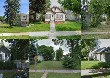
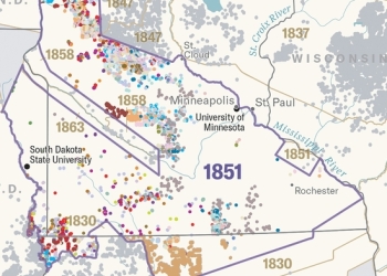
A couple of weeks ago, we posted a map of Minneapolis Racial/Ethnic Diversity Index. One of our Twitter followers very wisely requested we apply the same lens to the City of St. Paul. Here is that map.
What does this map show?
This map shows the diversity score* of St. Paul neighborhoods. “Diversity” refers to the relative proportions of racial and ethnic groups in an area (here, census tracts). An area has a high diversity score if it has more equal proportions of different racial and ethnic groups. An area with a low score has a high percentage of people from a single (or a couple of) racial/ethnic groups.

Why did we make this map?
Maps tend to consistently paint certain neighborhoods as good or bad. These narratives shape how we see ourselves as residents of these neighborhoods, or how we see our fellow residents who live in those neighborhoods. They are often missing historical, political and structural context about how we got here. These maps also depend on how we measure “good” / “bad” and “asset” / “deficit”. All neighborhoods have assets and deficits, some of which are subjective and some of which are objective.
Questions we are asking
Here are some questions we had as we made this map:
- Is racial and ethnic diversity in a place an asset to you?
- What are other ways of visualizing racial and ethnic diversity?
- What does this map mean for the City of St. Paul, especially as our region becomes more diverse?
- Who defines what measures we use to describe neighborhoods?
- What other measures can we use to describe neighborhoods? (coming soon… a map of economic diversity)
What do you think? What questions does it raise for you?
*We used a common statistical method to calculate the diversity score, which is the relative share of various racial and ethnic groups within a census tract. A census tract is more diverse if there is not a single (or a few) racial/ethnic groups who live there. The more equal the proportions of the groups, the higher the score. See (p. 7) for Diversity Index methodology.